August 2010 (updated in september 2010)
Towards Better Keyboards
Foreword
This is about a simple enhancement, which can benefit all keyboards, including those that don’t try to be ergonomic.
This is not about ergonomic keyboards. If you look for one, you will certainly love the Maltron, the Kinesis Contoured, or the Datadesk SmartBoard. (I don’t recommend Microsoft’s Natural keyboard, because it lacks the enhancement this essay is about).
I touch-type for over 3 years. I tried three different layouts: a french layout first, then Qwerty, an finally a dvorak-like one optimized for French which I am using right now. I use a Typematrix EZR2030 for over a year, and I have tried Microsoft’s Natural Keyboard for a few months. From this experience, I can tell that it is impossible to guess the quality of a layout or a keyboard before you tried it.
To the point
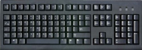
Look at this almost ordinary keyboard (Sorry, you can’t buy it: I faked the photo)
As you can see, its keys are aligned in straight columns. We will call that the matrix design. For two reasons, the matrix design is better than the usual staggered design. You know, that one (close-up on the alphanumeric part):
Comfort
First, the matrix design is more comfortable than the staggered design, especially when you touch-type. (Hunt-and-peck typists are less affected.)
See, touch-typists are supposed to allocate one column to each finger. It requires little hand motion, and allow you to stop looking at the keyboard altogether. It is both very comfortable and relatively easy to learn. Even more so when you use a reasonable layout, like Dvorak, or Colemak.
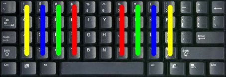
Most of the time, touch typists are taught to allocate the keys like this:
(Red: index, green: middle, blue: ring, yellow: pinky. Centre: indexes again, left and right: pinkies of course.)
This is the method I use right now. It allow me to allocate the same keys to each finger (including the numbers), regardless of the keyboard I type with (my Typematrix or a staggered keyboard). But for many people, this feels too… twisty. Instead, they use this one, which is a bit more straight:
This is the method I used until I got my Typematrix. Still, for some people, this is not enough. Their left hand is too uncomfortable, so they use a more symmetric (though non-standard) method:
Whatever the method, it is easy to notice that when you bend and extend your fingers, they don’t naturally follow those weird lines (which by the way aren’t even symmetric). So much for comfort. Straight lines are much better:
It took me a couples hours to get accustomed to my Typematrix (it has others differences, besides the matrix design itself). But in the end the matrix design proved much more comfortable. So much that I prefer my typematrix over my Natural Keyboard. I also didn’t lose my skills on the staggered design (even though I now loath it).
Compactness
As you can see in the pictures, the matrix design is slightly more compact than the staggered one. That makes it a better fit for laptops, netbooks, and other mini-keyboards. For a given size, it allows for slightly larger keys, making the the small keyboard less uncomfortable for everyone (not just touch-typists).
There are also minor advantages likes a straight inverted T for gamers, or a straight numeric keypad with the Fn key.
Conclusion
The matrix design is better than the staggered one. It is easy to get used to, even after years with the old design. It can be applied to every single keyboard on this planet.
Yet, this design is far from widespread. You may wonder why. after all, “this matrix look great, but why don’t we see it everywhere”? Well, because of this:
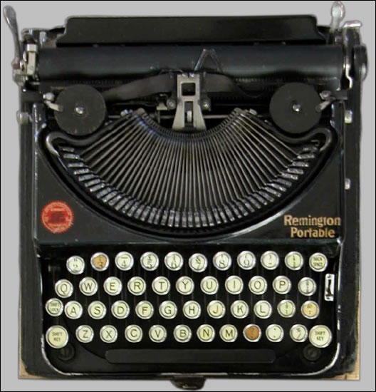
The first commercially successful typewriter, the Sholes and Glidden Type-Writer, where invented in 1867. It “featured” the Qwerty layout, and staggered keys, which actually worked around mechanical problems. (Touch typing didn’t exist then, so ergonomy was of little concern.) Note that Latham Sholes soon disowned the machine, refusing to use or recommend it. However, because of their initial commercial success, those two “features” soon pervaded the whole industry).
The staggered design (and the Qwerty layout) don’t make any sense any more. Here in the 21st century we use electronic keyboards. The mechanical problems we had 140 years ago are long gone. It is past time we evolve.


